Introduction
The main goal of this project was to identify meaningful and useful clusters (that share common characteristics) of flight delays for FAA regulated airports in the US. The data included name of airport, state, city, operational year (from 2004 to 2010), departures, arrivals, cancelations, number of delays and diversions, average delay times for a number of operational processes (such as taxi-out, taxi-in, airborne time, etc.). Please see a detailed description of the features here. Because some of the features were measured in minutes and some were measured in percentages, the data were normalized (scaled) before any analyses were conducted.
Principal Components Analysis
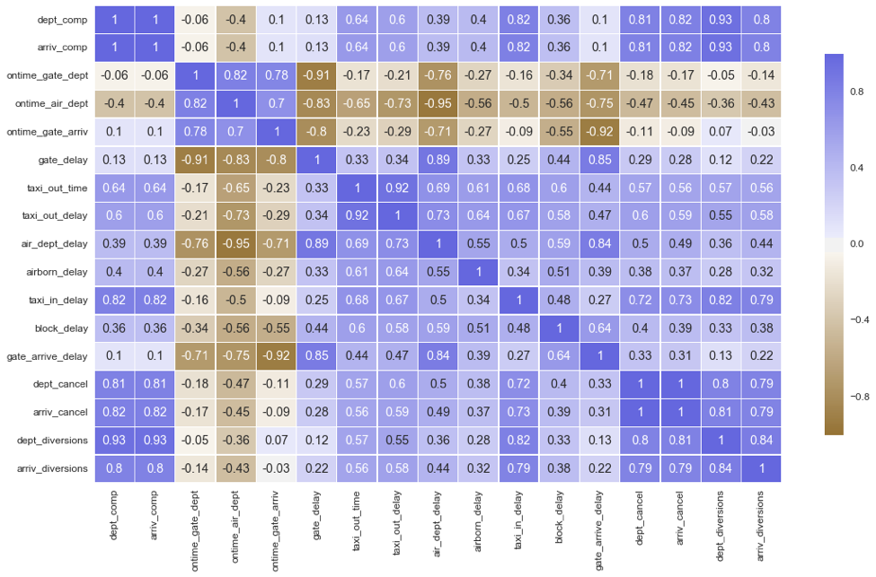
Principle components analysis(PCA) is a dimension-reduction technique that is completely different from clustering methods such as k-means clustering and hierarchical clustering. PCA seeks to find a best possible low-dimensional representation that explains the maximum amount of variance. Clustering, on the other hand, whether it is k-means analysis or agglomerative hierarchical analysis, looks for similar subgroups in observation data. Before conducting PCA, I needed to see correlations between variables to determine whether the variables have large enough relationships with each other.
As the correlational table above indicates, features are highly correlated among each other, so we can continue with the PCA analysis.
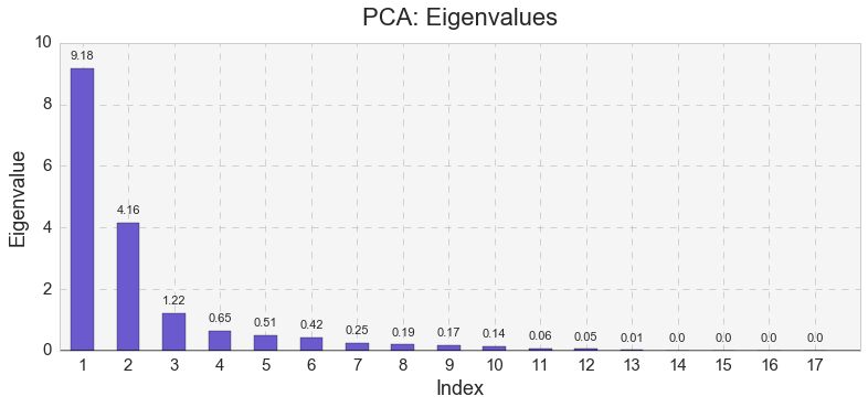
Next, I identified eigenvalues in the PCA model.
The analysis distinguished 17 eigenvalues. The very first eigenvalue had the largest value, while the first three eigenvalues had values larger than 1.
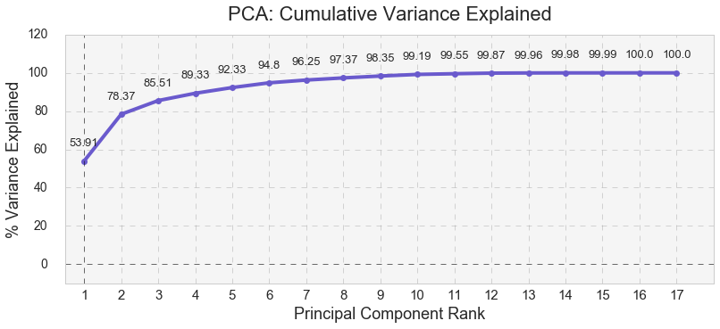
As shown below, the first three eigenvalues formed three major components that cumulatively explained 85.51% of the variance for airport delays. PC1 explained 53.91% of all airport delays while PC1 and PC2 together explained 78.37% of all airport delays.
I used Kaiser’s stopping rule to select the first three components. Kaiser’s stopping rule states that only the number of factors with eigenvalues over 1.00 should be considered in the analysis. However, using Kaiser’s stopping rule was simply an arbitrary decision I made in this specific case, because I was solely interested in identifying meaningful and useful clusters.
As seen in the table below, PC1 is positively correlated with all the features included in the PCA except for on-time departure and arrival. Here, PC1 is negatively correlated with the features. PC2 is positively correlated with only several features such as gate delay, air departure delay, gate arrival delay, and is negatively correlated with dept_comp, arriv_comp, ontime_gate_dept, ontime_air_dept, ontime_gate_arriv, taxi_in_delay,dept_cancel,arriv_cancel, and arriv_diversions. PC3 is positively correlated with on-time gate departure, taxi out time, taxi out delay, airborn delay, and block delay, and is negatively correlated with ontime_gate_dept, taxi_out_time, taxi_out_delay, airborn_delay, and block_delay.
| Feature | PC1 | PC2 | PC3 |
|---|---|---|---|
| dept_comp | .78 | -.55 | .09 |
| arriv_comp | .78 | -.56 | .09 |
| ontime_gate_dept | -.50 | -.71 | -.36 |
| ontime_air_dept | -.83 | -.47 | .002 |
| ontime_gate_arriv | -.45 | -.82 | -.10 |
| gate_delay | .61 | .70 | .28 |
| taxi_out_time | .82 | -.08 | -.46 |
| taxi_out_delay | .83 | -.04 | -.44 |
| air_dept_delay | .85 | .48 | -.01 |
| airborn_delay | .61 | .11 | -.53 |
| taxi_in_delay | .81 | -.36 | .05 |
| block_delay | .67 | .24 | -.32 |
| gate_arrive_delay | .64 | .68 | .04 |
| dept_cancel | .82 | -.36 | .23 |
| arriv_cancel | .81 | -.38 | .24 |
| dept_diversions | .75 | -.55 | .19 |
| arriv_diversions | .77 | -.42 | .19 |
K-means Analysis
K-means analysis is a clustering technique that seeks to group observations into a pre-existing number of clusters. In this type of clustering analysis, researchers have to specify the desired number of clusters. I conducted several k-means analyses with a various number of clusters on the original data and PCA-transformed data (the first three components identified in the PCA).
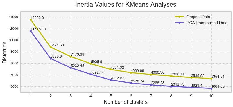
Inertia values shown above, measure how internally coherent clusters are, indicate that the PCA-reduced clusters contain less distortion that the original clusters and that the distortion decreases with a number of clusters. Overall, the high inertia values were indicative of a high distortion in the clusters (ideally, the lower this number is the less the distortion is), indicating that clusters’ cohesion might be too high while clusters’ separation might be too low. Since Euclidean distance tends to become inflated (a so-called curse of dimensionality), running a PCA prior to k-means alleviates this problem.
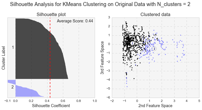
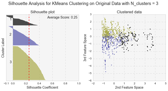
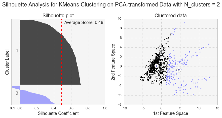
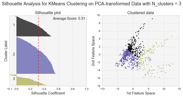
Another measure of k-means performance is the Silhouette coefficient. The Silhouette coefficient is calculated using the mean intra-cluster distance and the mean nearest-cluster distance for each sample. Below are the Silhouette plots for k-means analyses with two and three clusters for the original and PCA-transformed data. In general, we care not only for the average value of the Silhouette coefficient, but also for width of fluctuations in the size of the silhouette plots.
Even though the average value of the Silhouette coefficient increases for the PCA-transformed data, it is still relatively low (for two clusters: 0.44 vs 0.49, and for three clusters: 0.25 vs. 0.31). Because of the distortions in the original data,to see the clusters clearly, I had to represent the Silhouette plots for the original data in the space of 2nd and 3rd features. As shown below, as the number of k-means clusters increases, the Silhouette coefficient decreases as well. In addition, huge fluctuations in the size of the silhouette plots signal the presence of high cohesion among clusters, supporting the similar findings with the high inertia values. Moreover, the negative values of the Silhouette coefficient indicate a presence of outliers. For further analysis, I picked k-means results with 2 clusters for the PCA-transformed data. The two PCA-transformed k-means clusters give us the highest Silhouette coefficient and the reasonable (compared to the others), inertia value (0.49 and 6829.64, correspondingly).
Presenting K-means Clusters in Principle Component Space
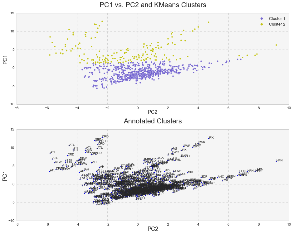
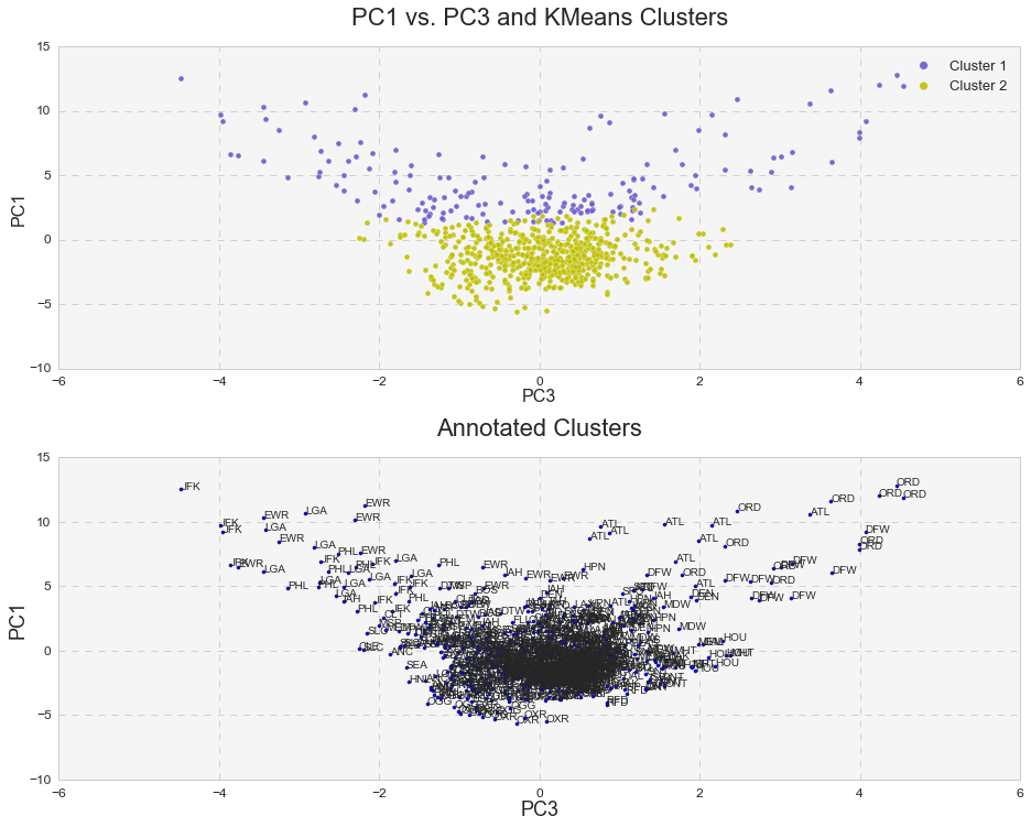
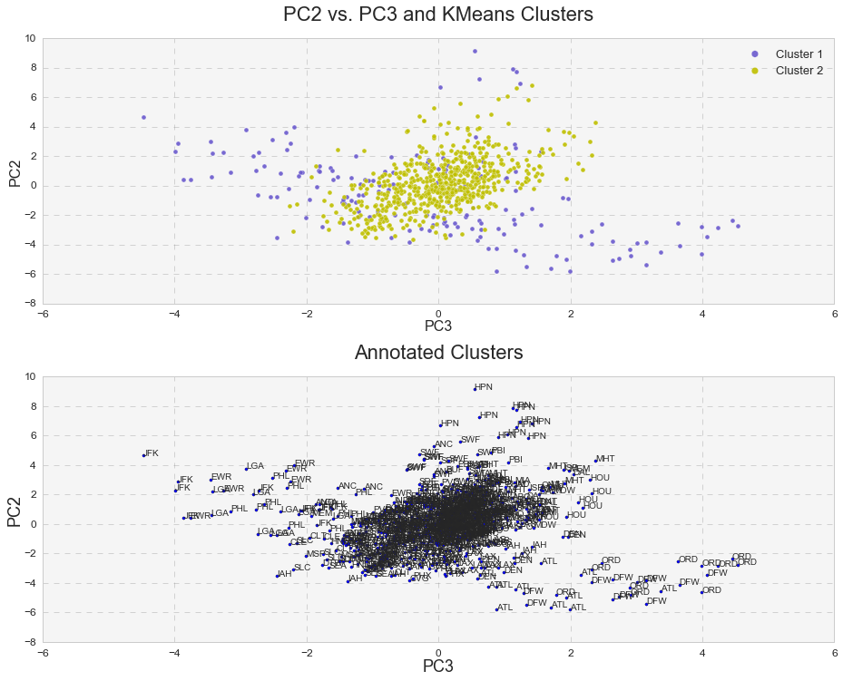
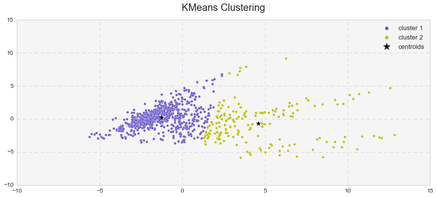
Furthermore, it was interesting to see how k-means clusters lie in the principle component space. In two dimensional space, I plotted k-means clusters along with annotated clusters to see which airport belongs to a given k-means cluster.
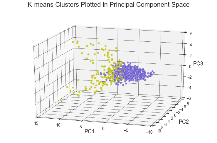
While OXR, RFD, MDW, OGG, SEA and etc. experience one type of delay and belong to the k-means cluster# 1, JFK, EWR, LGA, PHL, ATL, ORD, DFW and others seem to experience a different type of delay since they belong to the k-means cluster# 2. Below are the same k-means clusters plotted in the 3-D principle component space.
DBSCAN and identifying outliers.
DBSCAN is another useful clustering algorithm, which stands for Density-Based Spatial Clustering of Applications with Noise. There are several advantages of using DBSCAN: 1) it does not require to know the number of clusters in advance, 2) it can capture clusters of very complex shapes, and 3) most importantly, it is extremely useful in identifying outliers or points that are not part of any cluster.
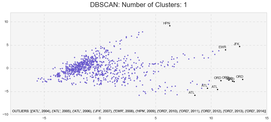
The DBSCAN analysis with min_samples=10 and eps=2.4 yielded the highest Silhouette Coefficient of 0.63 and identified only one cluster with 11 outliers. Those were: ATL(2004), ATL(2005), ATL (2006), JFK(2007), EWR(2008), HPN(2009), ORD(2010), ORD(2011), ORD(2012), ORD(2013), ORD(2014).
Agglomerative Hierarchical Clustering
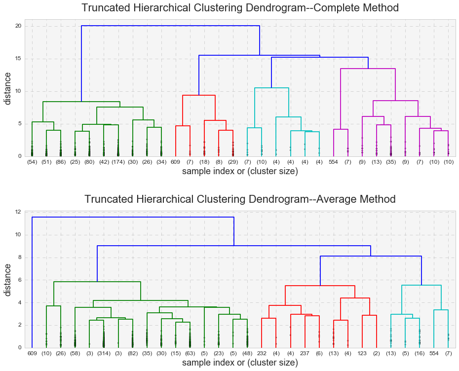
Hierarchical clustering is the last clustering approach that I will review here, and just like DBSCAN, it does not require a predetermined number of clusters. One advantage of hierarchical clustering over k-means clustering is that it produces a dendrogram, a tree-based representation of observations. The algorism looks for dissimilarities between a pair of observations. The concept of dissimilarity is extended to a pair of groups of observations, and this extension is achieved by introducing the notion of linkage, which detects the dissimilarity between the two groups. Average and complete linkages are usually preferred over single linkage. The complete linkage measures the farthest pair of points, and the average linkage measures the average dissimilarity over all pairs. Because the complete linkage can have problems with crowding (and the observations here are pretty crowded), I used the average linkage in addition to the complete linkage.
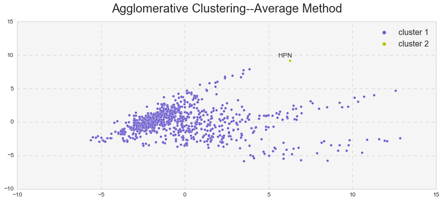
It looks like the complete linkage behaves similarly to k-means analysis and the average linkage behaves similarly to DBSCAN. Indeed, we can see that the average linkage identified an outlier (observation #609 – HPN in 2009). The same outlier (and more) was observed in the DBSCAN analysis. In addition, the average linkage yielded a much higher Cophenetic correlation than the complete linkage (0.83 vs. 0.67).
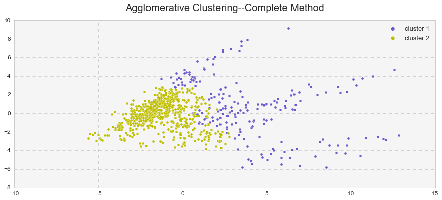
To illustrate my point better, I presented the observations in a two-dimensional space and compared them to the k-means clusters.
As seen above, the hierarchical clustering with the complete linkage forms two clusters – just like in the case of the k-means analysis. On the other hand, the hierarchical clustering with the average linkage forms one cluster and one outlier – just like in the case of the DBSCAN analysis. In reality, it forms two clusters, but because the second cluster consists only of one observation, the average linkage method serves as an outlier detector in this case.
Conclusion
The clustering techniques above identified two clusters and several outliers. First, the principal component analysis identified three major components (PC1, PC2, and PC3) that cumulatively explained 85% of all variance for airport delays. PC1 explained 54% of all airport delays while PC1 and PC2 together explained 73% of all airport delays. K-means analysis, on the other hand, identified two major clusters. However, a relatively low Silhouette coefficient and high distortion signaled a presence of cohesion among the clusters. Performing k-means cluster analysis on the PCA-transformed data improved the Silhouette and inertia scores and slightly decreased the cohesion. DBSCAN analysis revealed only one major cluster with several outliers: ATL(2004), ATL(2005), ATL (2006), JFK(2007), EWR(2008), HPN(2009), ORD(2010), ORD(2011), ORD(2012), ORD(2013), ORD(2014).
The same phenomenon was observed in the hierarchical clustering. The complete linkage method vs. average linkage method yielded a lower Cophenetic correlation, confirming the presence of high cohesion among clusters. The average linkage behaved identically to DBSCAN and identified one cluster and one outlier, HPN(2009).
The evidence above indicates that flight delays in the U.S. form two meaningful and useful clusters. K-means and the hierarchical clustering with an average linkage identified these clusters. However, because the clusters revealed some cohesiveness with each other, DBSCAN and the hierarchical clustering with the average linkage identified only one cluster with outliers. It is very likely that removing the outliers will result in only one meaningful cluster.

